Can you believe it’s already November?!
The Fall weather has gotten me in the mood for some serious reorganizing, including revamping my web presence.
Over the next few weeks, I’ll be working with a web designer to create a totally new look for my website and to integrate my blog into it. I’d love to get your input!
I’ve been trolling the web looking for things I like, and things I don’t, so that I can give the designer a good sense of how I’d like the site to work.
For example, my new publisher would like my site to have more of a romantic suspense feel than it’s current romancey lilac colors. I love the suspense look of a white-on-black site, however, I can’t read them. I mean that I literally can’t read white on black for more than a paragraph or two. My vision starts to go hazy with white lines floating across it and I get a headache.
Do you have any experiences like that? Color combos you love or hate?
What do you currently like about my Sandra Orchard website? How about this blog?
I’m talking about anything from content, to the location and type of page tabs, to the amount of white space, to one- versus two- versus three-column formats.
What do you go to an author’s website for? Book extras? Writing tips? Resources? To learn more about books or upcoming ones?
What do you wish more authors would have on their websites? Feel free to share links to your favorite examples.
Any pet peeves about websites, blogs?
My biggest frustration with some blogs is figuring out how to leave a comment if someone hasn’t already left one. Sometimes the icons or words are so small that if you’re not familiar with the blog template, the button is impossible to find. If you’ve found a blog that is not like that, please share the link, I’d love to check it out.
My designer will be using a template, which limits me somewhat over the html design I’m currently used to, but it’s a lot more economical way to go in terms of design time, and hopefully he’ll have the expertise to mold it to my preferences.
Your Turn: I’d love to hear your thoughts on any of the above!



 RSS - Posts



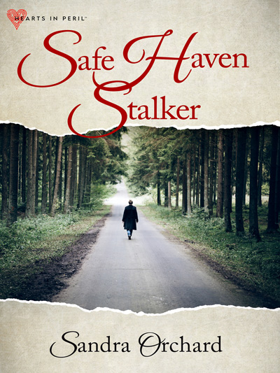
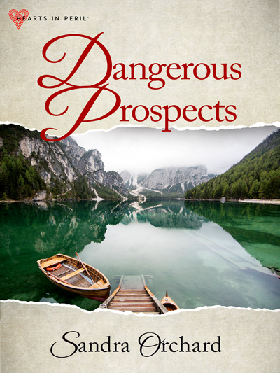
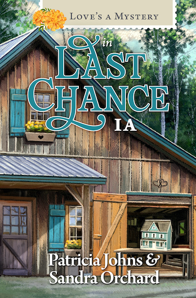
I don’t like moving objects. And I like the “contact” button to be easily found at the top or bottom of a list, page, or bar. And the “about me” blurb to be easily found as well. I like Arial font when it is small but once it gets a certain size I find it looks tacky. I like the photos of your books on the side. I like having that clear image of exactly what I’m looking for at a book store. If there’s links I like to know why they’re there that way I can differentiate them between advertisements and actual sites the writer recommends. I’m not fond of seeing the profile pics of the Facebook followers or members. To me it clutters things and looks like an ad. If there’s a sign up for newsletters or a follow button for a blog, don’t make me look for it. I like search bars and sign up bars to be readily accessible near the top of the page — and what’s with these search bars on people’s web pages that goes to a google search of the entire web? When I search on a webpage I want to find it on their webpage… Essentially I want it to be as easy as possible for me to see and go directly to where I want to go without having to spy through the entire site. I love share buttons too. 🙂 I’d say go with your gut when designing your web page. Go with what you love because that’s what will best define who you are.
You’ve made some wonderful suggestions. Thanks so much!
One thing I really like about your current website is that your books are prominent on the page. They’re easy to find & you have the link to purchase. Your left sidebar makes navigating your site very easy. The site is fast loading without a bunch of techie gizmos slowing it down.
I’d love to see a picture of you displayed on your home page, so readers connect right away with the author.
What I don’t like is music on a site–it plays over the music I already have playing.
Thanks Brenda…I especially like your perspective on the author pic. I think I want to go with a less formal picture though.
Your website now is easy to navigate which is nice.
I hate it when blog print it too small or hard to read because of the colors. And yes, when I can’t figure out how to leave a comment is a pet peeve with me too.
Oh, small print is the worst with my iMac. A site can be perfectly readable on my laptop and then have infinitesimal print on my mac, and when I zoom in, things sometimes go whacky, especially stuff in frames. I find it such a challenge to now what print size to choose for that reason.
Oooh, a new website is exciting!!! Like you, there are color combos that make it hard to read. I also loathe captchas. I can never get them right! lol
Oh, yeah, captchas, the bane of all bloggers. LOL